A few weeks ago I was speaking with a potential client company about running some seminars for them on culture change. One of the things they asked me to think about was - what would be an appropriate symbol for their change program?
And this did get me to thinking ...
Why? Simply because dry logic only gets you so far with your prime change audience - the people. Logic and reason and facts and data are all important, of course, but not so inspiring or exciting.
So what would be an appropriate change symbol?
Lots of recent research internationally, and also in Australia, points to the importance of having a dedicated, and even a named change program. The Woolworth's Supermarket chain in Australia have 'Project Refresh' for example. (http://www.woolworthslimited.com.au/aboutus/ourhistory/index.asp)
We also often see new logos appear as part of a rebranding strategy - a frequent component of a change program. Think of any of the major Australian banks ... National Australia Bank is now "NAB", etc.
So, we might have a named change program. We might even have spent lots of dollars on a new logo. But how effective will they be in grabbing the attention of the various stakeholders during the change?
So what would work better? What would really grab someone's attention, inspire them, excite them?
My view is that this where the arts really come to the fore. Without doubt the detailed analysis, planning, decision-making, etc all needs to be done, but to capture our attention and excite us, there's nothing like a striking image, or a funky or uplifting tune. I'm not a big Rolling Stones fan, but how good was the Microsoft launch of Windows 95 with 'Start me Up'? And they made US$8million as well! (http://www.youtube.com/watch?v=5VPFKnBYOSI)
But you don't have millions of dollars sitting around to spend on a change symbol right? What might work for you?
You've done a lot of the analysis and planning right? Somewhere, somebody has been able to outline the vision - what it's going to look like, feel like, be like if the change program is successful. If someone in your team can put that into words, can the team also think of a picture, an image, a scene from a movie or a song that sums up the journey or the destination? If they can, your team has uncovered a powerful tool that has the potential to excite and inspire your stakeholders. That image or that song will grab the stakeholders in the gut, as surely as the analysis will grab their heads.
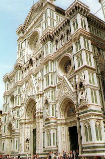
So that gets us back to the photos at the start of the blog and below. They are images that I love. It's the Duomo (cathedral) of Santa Maria del Fiore in Florence, Italy. (Thanks to http://www.freefoto.com)
Sure, there are lots of old churches that are beautiful across the world. But what is special to me about this Duomo is that it symbolises change so well.
While I was in Italy in September last year, I learnt a little about the restoration of their numerous monuments. Interestingly to me, there is constant debate about the validity of restoration work. Are the changes that are necessitated by the passing of time what the artists originally intended, etc?
This is why Florence's Duomo is so interesting. Because it was constructed over a long period of time, various artists, builders, supporters and labourers were involved with a constantly morphing vision of what the completed Duomo should be. Does that sound familiar to your organisation?
Construction was begun by the sculptor Arnolfo di Cambio in 1296. Numerous local artists continued to work on it during the following century and a half. But, the massive octagonal cupola that truly dominates both the church and the city was the proud achievement of Filippo Brunelleschi, master architect and sculptor and it wasn't started until 1420.
The cathedral of Florence itself had been begun in the Gothic style. But in 1366 the City of Florence, following the advice of certain painters and sculptors, decided that the Gothic should no longer be used and that all new work should follow Roman forms, including the now famous dome built at the east end of the nave.
A modern façade of the cathedral, executed by Emilio de Fabris in 1867-87 in the style of the Gothic Revival, has taken the place of one which was destroyed at the end of the 16th century.
When you see the Duomo today, you can see its Gothic nature, the towering Roman style dome, and the most recent neo Gothic facade.
What a wonderful symbol of change. Evolution not revolution. The engagement of many many workers in its construction and upkeep over centuries. And most importantly, the inspiration of countless visitors over time.
Your organisation could do worse than picking the Duomo as its change symbol.

